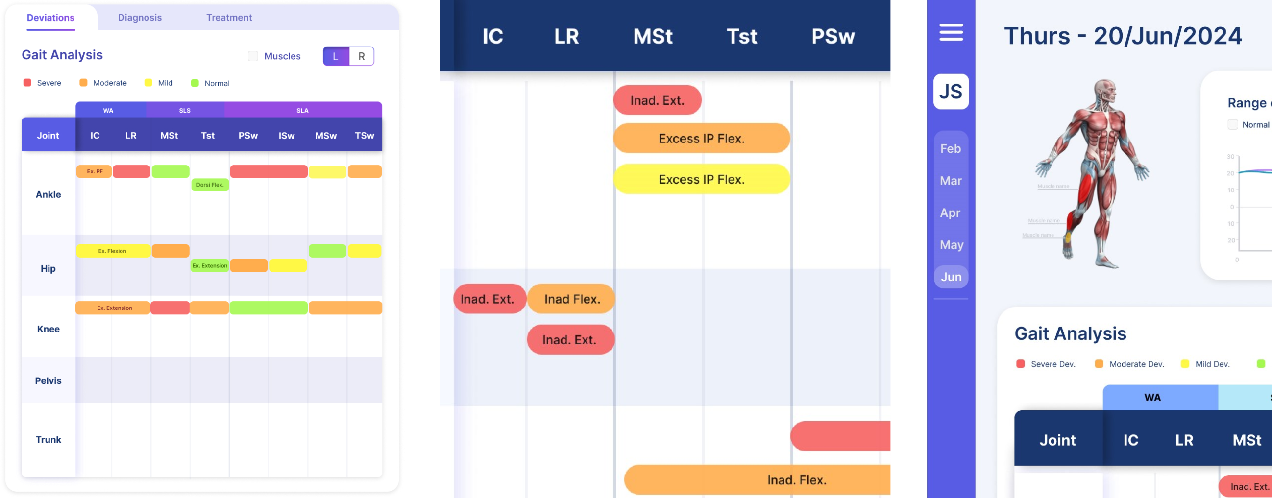

At Kinetic Motion Inc. (KMI), I designed an intuitive user interface to present detailed gait analysis reports derived from advanced motion-tracking technology. The interface was developed to streamline data interpretation for medical professionals, enabling the diagnosis of muscle deficiencies and gait weaknesses for fall prevention treatment.
This project was part of a larger, federally funded initiative under the San Antonio Claude D. Pepper Center at UTHSCSA with applications in Alzheimer's disease, which is supported by the NIH. Working closely with subcontractors on this initiative, Dr. Marcus Hollis, CEO of Blue Bay Research (BBR), and Dr. Wei Liu, Associate professor at UTHSCSA, my work contributed to improving the usability of complex medical data, enabling healthcare professionals to make informed decisions.

Traditionally, medical professionals rely on observational gait analyses, which uses checklist forms that are limited in accuracy and vulnerable to observer bias. Current tools often suffer from excessive complexity or lack user-friendly interfaces, leading to time-consuming workflows and potential diagnostic errors.

To further clarify our goals, I also narrowed down two types of future users:
I needed to make a design that emphasized with both user groups, to maximize the functionality of this interface.
Medical professionals need a streamlined, intuitive solution to analyze patient gait patterns and diagnose related issues.

After researching about the diagnostic process, I created this flow comparison with feedback iterations from my mentor which gave more insights on what features were crucial and which were not. I narrowed them down to the following:

With those insights, I began sketching possible UI orientations, focusing on the features that needed to be presented together for user comparison.

The first prototype draft above was focused on the deviations mapping feature concept and had an overall simplistic layout.
Through discussions with my mentors, features were moved around and refined. For example, the colored deviation graph was too cluttered and ineffective for multiple deviations to be represented. In response, I simplified the presentation to lower the cognitive load of users.


